2 Color
Color plays a big role on websites. You typically want a consistent color scheme throughout that usually matches the branding of your business. If you do not have a brand color scheme already or if you only have one or two colors that you use, then you may want to do some more research into color schemes. There is a whole area of study on color called color theory that discusses what types of color patterns are best for different moods and statements of a brand. Websites usually require a minimum of 3–4 main colors. Usually, you do not want anything more than this, with a few exceptions.
- Primary: the primary color is the most used color (other than white, black or neutral colors) on a website.
- Secondary: the secondary color is the second most used color or can be used as accent colors.
- Accent color: this is optional third color and is used sparingly as accents throughout.
- Base: this color is the darkest color typically used as a dark background or for dark text. Think black, dark navy blue, or dark navy greens.
When choosing a color pallet, it can be hard to visualize how these colors will be used on a website as most color pallets generated from online tools show equal sized bars of each color next to each other.

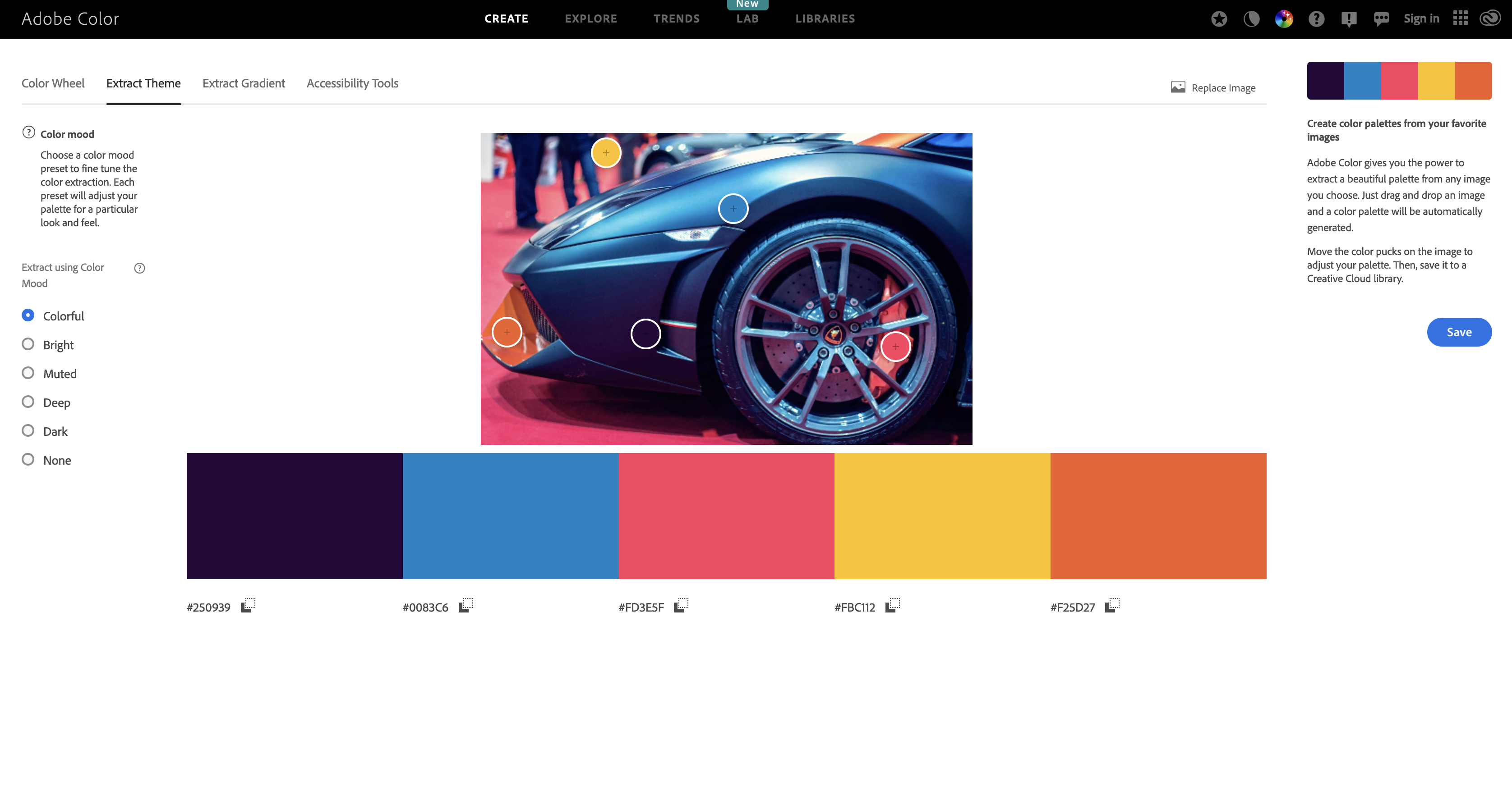
In reality the ratio of each color will vary as the base color will be used quite often with white backgrounds and then the primary followed by secondary used much less throughout and finally the accent color very sparingly. This creates a much different picture of color use than a generated color pallet. I recommend searching for images with a good overall color scheme that provides the mood or feel that you like then pull your colors from that image. You can use color.adobe.com/create/image to achieve this by uploading a photo and receiving a generated color scheme. See the below example.
Colors generated:
Colors are usually identified by a code. Either a six digit code made of letters and numbers called a hex code that usually has a hash tag in front such as "#A8F241". This code will ensure the exact same color is used throughout your website.
Once we have the main color pallet, many shades of each color can be used as necessary to add more depth to the website.
Contrast
When choosing colors, accessibility must be considered not only for your viewers but also for good search engine optimization which is how search engines such as google and bing decide if your site is worthy enough to list higher on the results as a good source for the person using their search. You can check contrast with color options at https://color.adobe.com/create/color-contrast-analyzer or https://coolors.co/contrast-checker/.
Check out the following color tools:
- Color Pallets
- Contrast checker
- Generate colors from an image